
I knew I needed a new logo. Badly. I just couldn’t get inspired to create one. So when the opportunity to completely revamp my website came up, I knew it was the perfect time to work on some re-branding as well. I am by no means a graphic designer, so I decided to hire someone to create it for me, with some of my own ideas of course.
My cousin, a well-connected Guatemala City urbanite, led me to one of her contacts, Marylina Grill, and her company Papel Magenta. Those of you who have followed my work for some time know I have deep connections to Guatemala and travel there often. Hiring a Guatemala-based company to design a logo for me just felt totally right.
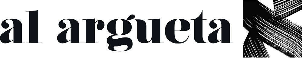
The first order of business was to find a new font for my name. We worked with several and finally narrowed it down to one that’s similar to that used by one of my favorite travel magazines and clients, Conde Nast Traveler. We felt it looked elegant and represented the travel/editorial nature of a good portion of my work.
As for a symbol to go with my name, I had been giving this a lot of thought. Many photographers use their initials in some sort of stylized form. But I thought my initials, “AA,” looked too much like a certain airline or 12-step program. I also wanted something that better reflected me personally and creatively. So I decided on an Aleph, the first letter of the Hebrew alphabet.

In addition to Aleph being the “A” equivalent I was looking for, I chose it for its spiritual and metaphysical connotations. Jewish tradition regards the Hebrew letters as sources of divine creative power. Were they to disappear altogether from the world, sages tell us, creation would vanish along with them. Aleph is a silent letter with a numerical value of 1. Its original pictogram derivative is the symbol for an ox. And so it’s easy to see that it represents preeminence and strength. Hebrew sages also regard Aleph as signifying that our accomplishments, big or small, first emanate from stillness and silence. The latter point resonates strongly with my own creative experience.
And so we embarked on the process of creating a beautiful, stylized Aleph to go with my name. A couple of weeks later, and after a vacation in Bali, we still hadn’t settled on a proper Aleph. I wanted something that looked like calligraphy, but I realized that unless I hired a calligrapher, I wasn’t going to get what I needed. That’s when I found Paris-based Michel D’anastasio of Evolusign, who creates beautiful calligraphy of Hebrew letters. He hand-painted a unique Aleph, which was then sent to my designer. Having seen Michel’s work in which Hebrew characters are photographed at an angle and made into art, I decided a final tweak for the logo was to likewise tilt it and give it a unique twist. It came down to two final versions. After input from family and friends, I decided on the final art.

As you can see, the final version has the ‘tilted’ Aleph. I felt it gave the symbol a feel of being ‘lifted up.’ I also felt it represented seeing things from a different and unique angle, which for a photographer is what it’s all about.